June 5, 2021
After a year and a half of viewing art in isolation, there was finally an opportunity for me to return to museums. My destination for my first day of summer break is the Getty Center, overlooking the Los Angeles cityscape. When I arrived at noon, the azure sky provided the ideal backdrop to the off-white architecture. Like many other visitors, I like the Getty because it is not a dry museum experience. Here one can view art, have lunch, read a book, take a stroll in the garden, and return to the galleries. Its diverse collection ranges from antiquities to impressionist paintings to photographs, appealing to all kids of tastes. Although the collection in most of the upper levels were not open at this time (much to my disappointment), I saw many essential works and made new discoveries.
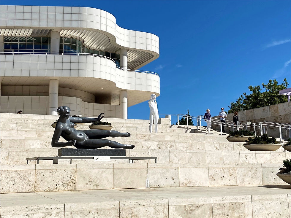
Figure 1: Photo taken by me of the entrance of the Getty, showing Air, 1938, Aristide Maillol (left) and Boy with Frog, 2009, Charles Ray (right)
When I got off the tram, I was welcomed by a lead sculpture (left sculpture in figure 1) that familiarly indicated my arrival. Although it has passed me several times in the past, today is the first instance when I have decided to take note of its title, which was surprisingly formatted in the same way as two other works I have seen at the Norton Simon Museum—La Rivière (River) and La Montagne (Mountain). The title of this piece is Air, which is a single-worded but powerful element of nature (originally named in French), just as the words "river" and "mountain". The form of the woman – plump, slightly elongated, and larger than life – also resonates with me as the sculptor's style. After my visit, I found out that these three works were indeed by the same artist and can even be attributed to the same creative period as they were molded within five years of each other.
Figure 2: La Rivière, 1939-43, Aristide Maillol (left) and La Montagne, 1937, Aristide Maillol (right)
What I find memorable about La Rivière and La Montagne is the hidden genius behind their design. Though seemingly different, the two sculptures depict the same posture: one leg folded, another bent before the body with one palm facing upward and the other arm lowered. The former is the latter is flipped on its side, which to the viewer comfortably creates an entirely different effect: while the La Rivière is fluid as a river, La Montagne is upright as a mountain.
Photographs
As mentioned, the Getty Center buildings established its squares and gardens to diversify their art experience. The thoughtfully selected greenery compliments the awe-inspiring architecture. There is a great angle to capture photographs at every corner, and below are my favorites among my own pictures:
Figure 3: Three photos taken by me, use slider on the right to view all.
Favorite Works
A prevalent guide for museum-goers is to check-in at the most famous pieces: the Van Gogh's, the Monet's, the Picasso's, etc. I was certainly one of those people a few years ago, when I found myself only able to appreciate works that others admired. Although there are no absolutes in the process of viewing art, we must realize that the value of a piece of art is not so simply measured by its fame and highly subjective. Although most renowned pieces are known for their brilliance, many of these prominent artists remained in obscurity for a long time until they were fully recognized. Based on personal experience, I believe that lesser-known artists can produce stunning works while prestigious artists can produce mediocre work. This is the leading principle for the pieces that I chose to show here. Who created this piece is not my primary concern when evaluating its merit, but rather which of its characteristics that draws me in and provokes me to delve into its meaning and context and make further connections.
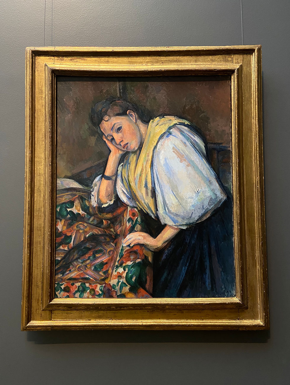
Figure 4: Young Italian Woman at a Table, 1895-1900, Paul Cézanne
When I walked into the gallery, my first observation was that this painting had been relocated from the center of the wall in front of the seats to the right corner. This observation implies my existing interest from my last visit and it continues to fascinate me today. The glass quality to her eyes, her subtle daydreaming expression, and the ultramarine undertones are among its most outstanding features. After some contemplation, I thought that it was highly similar to the subject of another painting by Johannes Vermeer titled A Maid Asleep (figure 5). The vivid patterns of the table cloth, the young woman leaning on one hand with the other rested on the edge of the table, and the silence of the room are present in both works.
Despite much research, I have not been able to find any online source that describes this resemblance. However, allow me to boldly speculate that Vermeer's work was used as a direct reference to Cézanne's painting, for this is a very common practice for artists throughout history. After his death, Vermeer and his works were mostly ignored for two centuries until about 1860, when a German museum director rediscovered them. This provided the basis for a researcher to later compile and publish an extensive catalog of Vermeer's works in a French art review (Cézanne was also French) called the Gazette des Beaux-Arts, which drew international attention and introduced Vermeer to the public. Cézanne may not have seen the original The Maid Asleep, but there is a substantial probability that he might have read about it in this catalog, causing him to create his own modern interpretation.

Figure 5: A Maid Asleep, 1656-57, Johannes Vermeer
Another aspect of Young Italian Woman at a Table that I find ingenious is the composition. The lines formed by the corner of the room, the trims of the walls, and the edge of the table all extend to intersect at the young woman's face, creating a vanishing point effect found in one dimensional perspective. It naturally guides the viewer's eyes to her face and her alluring countenance, which is the focus of this painting. What is more interesting is that Vermeer has also famously used this technique in paintings like The Music Lesson to achieve the same results, further suggesting that his work was used as inspiration.
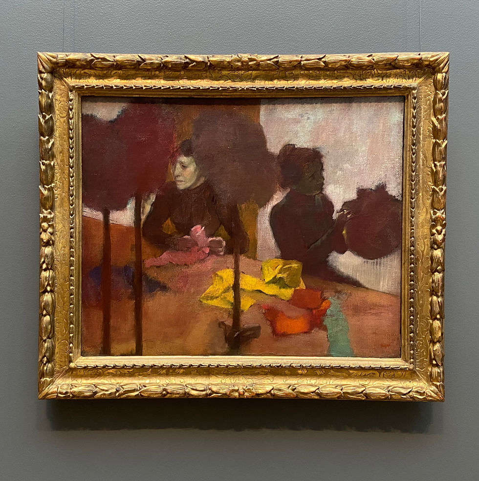
Figure 6: The Milliners, 1882, Edgar Degas
What I like about The Milliners is its richness of color. At first glance, this painting seems to be simply a few blocks of alike shades with little detail. However, a closer look show us that no surface has been flatly painted over, and that there are countless variations within one color. For example, the white wall in the background contains touches of bright turquoise, pink, light purple, and brownish grays. As someone who paints with oils, I can also tell that they are overlaid with lighter colors over a darker underpainting, which peaks out at the edges (like the dark blue at the top left corner). Moreover, color is a tool that Degas skillfully uses to strengthen the composition and create balance and focus. While maintaining a reddish-brown tone, he also used seemingly dissonant colors like turquoise and bright yellow. The contrast between saturated and grayish tones and between the specific and the vague is what makes The Milliners a satisfying picture.
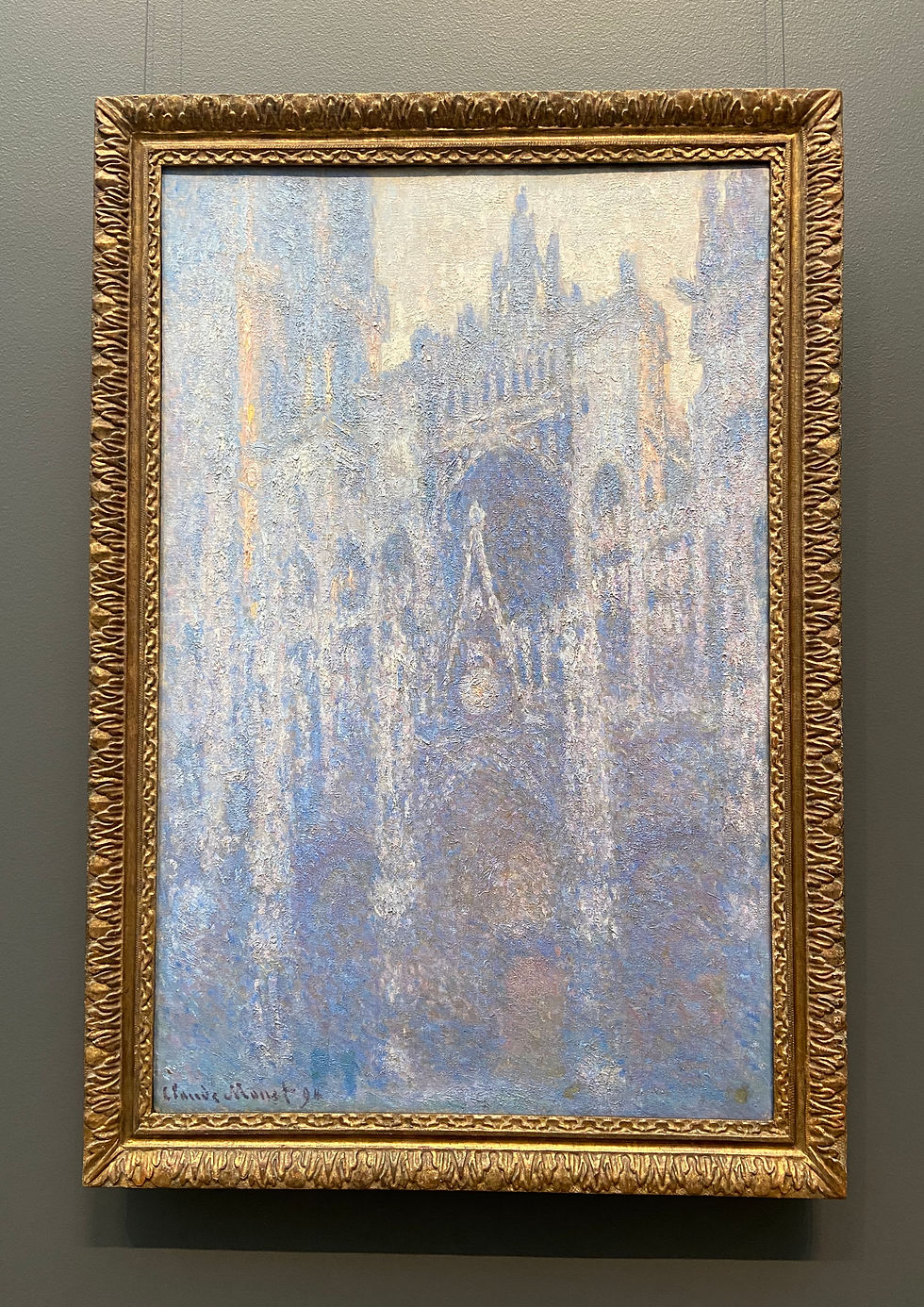
Figure 7: The Portal of Rouen Cathedral in Morning Light, 1894, Claude Monet
This hazy and somewhat hallucinogenic picture of the first morning light on a grand gothic cathedral is a scene that Monet painted over thirty times during different times of the day. I have seen these other versions at the Art Institute of Chicago and the Metropolitan Museum of Art, but this one is among my favorites because it creates a highly-complex and airy image with color palette limited of ultramarine, sienna, white, and orangish-yellow. The painting technique, especially the use of thick and pasty paint, forms a distinctive image when looked at from afar and an abstract palette of paint when looked at closely. This unique texture also has a story of its own, urging me to almost touch it.
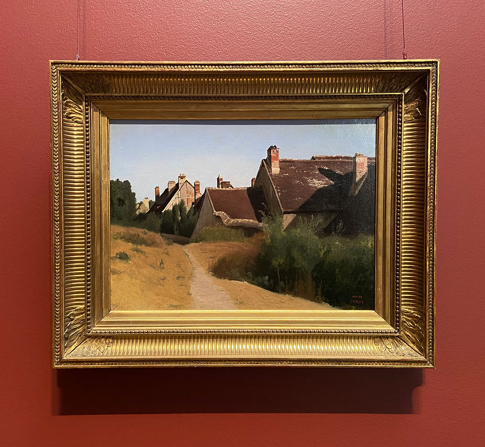
Figure 8: Houses near Orléans, 1830, Jean-Baptiste-Camille Corot
This small piece was placed next to another painting by Corot, Italian Landscape, of much larger dimensions. Though Houses near Orléans is simpler, its charm is no less than that of its imposing neighbor. When standing in front of this painting, I can feel the gentle wind blowing across this small town, shuffling the tall grass, shifting the dust patterns on the road, and wearing down the wooden cottages. The vividness and tangibility of this painting makes me feel as if I could step onto that road if I took another step forward.
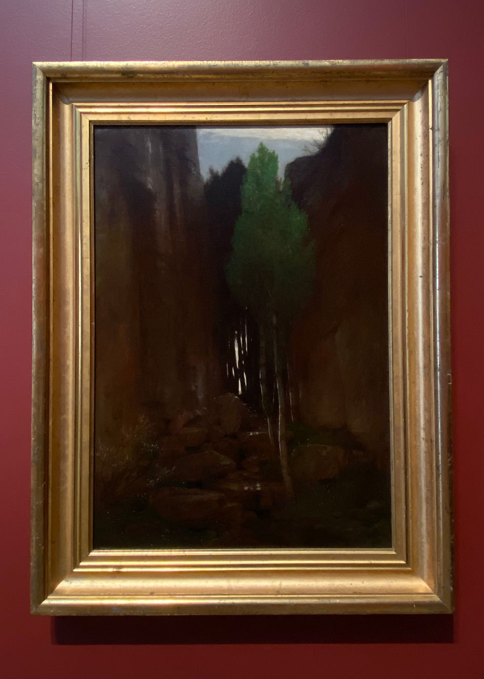
Figure 9: Spring in a Narrow Gorge, 1881, Arnold Böcklin
In continuation on the idea of atmospheric paintings, I noticed this piece for its mysterious quality. A single birch with emerald-colored leaves springs up from the rocks between two cliffs and the pale light, remnants of either dawn or dusk, touches the top branches of the birch. Strips of light continues to seeps through the crevices formed by the interlacing trees in the back. For me, looking at this painting has almost meditative effects, bringing spiritual calm.
Interesting Finds
Other than the art I have seen today, I made other exciting findings at the Getty store. Behind the rows of souvenirs and stationery, the store houses an extensive number of art history books on subjects not limited to those collected by the Getty. I enjoy selecting books in a store or a library more so than browsing online because I am looking through a selection filtered by someone with an understanding of art history. I chose three books from the store, two of which I purchased on-site and the other online (due to a lower price).
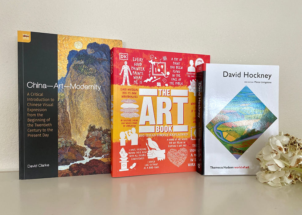
Figure 10: From left to right, China—Art—Modernity by David Clarke, The Art Book: Big Ideas Simply Explained by DK, and David Hockney by Marco Livingstone
To get an idea of a book, I read the front and back covers, the table of contents and skimmed through the pages to see the pictures. Each book had specific points that interested me, briefly described as follows.
David Hockney by Marco Livingstone:
When I search for books on Hockney, I often receive a flood of resources, a very often situation for an acknowledged artist. This book seems to give a panoramic analysis of Hockney's career, showing most if not all of his works as well as his drawings and reference photos that I have not seen.
The Art Book: Big Ideas Simply Explained by DK:
I own two other books from the Big Ideas Simply Explained series by DK on Shakespeare and Philosophy. To explain a subject that may appear to be intimidating with simple and concise terms is what this series does best. I hope that this book will give me a chronological outline of art history, which I have not studied before.
China—Art—Modernity by David Clarke:
Chinese modern art history is a subject that I have explored, through artists like Liu Xiaodong (I have wrote a blog on his most famous works, The Three Gorges Project), and will continue to do so. I am always interested in an opportunity to encounter new artists and movements.
All the books I have chosen are about a period that has witnessed change and variety, whether it is a century of Chinese modern art or the decades of David Hockney's career. Although some galleries remain closed, this visit to the Getty is an excellent beginning to this summer of art.
Works Cited
"Johannes Vermeer | A Maid Asleep | The Metropolitan Museum of Art." The Metropolitan Museum of Art, www.metmuseum.org/art/collection/search/437878. Accessed 16 June 2021.
"Johannes Vermeer." Wikipedia, the Free Encyclopedia, Wikimedia Foundation, Inc, 8 Mar. 2002, en.wikipedia.org/wiki/Johannes_Vermeer. Accessed 16 June 2021.
"La Rivière (The River)." Google Arts & Culture, artsandculture.google.com/asset/la-rivière-the-river-aristide-maillol/1AGK4lpoXpP1zw. Accessed 16 June 2021.
Museum, Norton S. Handbook of the Norton Simon Museum. 2003.
National gallery of australia. "National Gallery." National Gallery - Search the Collection, searchthecollection.nga.gov.au/object?
keyword=Aristide%20Maillol&searchIn=artistOrCulture&uniqueId=116514. Accessed 16 June 2021.


Kommentit